[Affiliate]

Blog Stats
- 3,302,285 hits
-
Join 3,247 other subscribers
- Follow wmfexcel on WordPress.com
Search wmfexcel
Want Google to translate this page?
-
Recent Posts
Top Posts & Pages
- Perform VLOOKUP with 2 lookup values
- Dropdown calendar in Excel
- Date Formats - A trick to format date with "st", "nd", "rd", "th"
- About
- Advanced vlookup - wildcard characters "?" and "*"
- Sequential number for visible rows only
- =SUM('???'!C3) Is it a valid formula?? No. It is magical indeed!
- SUM vs. SUBTOTAL
- [Guest Post] 5 things you should start doing with Power Query
- Quickly delete/hide records (rows) with Strikethrough format by using Find and a couple of simple techniques.
My YouTube Channel
My Facebook page
- My Tweets
Category Archives: Chart
Add Data Labels for Total to Stacked Columns in #Excel
When we create stacked columns in Excel, we exclude Total from the data as it may give an extra stack that we don’t want. However, we may want a data label for Total on the stacked columns, like the one … Continue reading
How to sort bar chart in descending order?
Sound like a silly question, but it is a bit confusing indeed. One day, a friend asked me how to sort a bar chart in descending order. I told her to sort the data. She replied: “I did. The data … Continue reading
Waterfall chart is just a few clicks away with #Excel 2016
Did you know, you can plot a Waterfall chart in #Excel in less than a minute…Provided that you are using Excel 2016 or later! 🙂 No Kidding! You may download a Sample File to follow along.
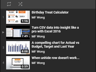
A compelling chart in three minutes…
In business world, we often compare actual sales to various benchmarks such as budget, target, and last year. In this post, I am going to show you step-by-step how to make a compelling chart for this purpose. This is basically a simplified version of bullet chart, and is super-easy to create. I hope you find it useful and relevant. Continue reading
Interactive Chart is not difficult to make – Part 3/3
Using Option Button to display different items on chart So far, we have made an interactive chart with check box to highlight items with negative growth; with scroll bar to see more items in a confined space. In this post, … Continue reading
Interactive Chart is not difficult to make – Part 2/3
Using Scroll Bar to show more This is an extension of the previous post – Using Checkbox to highlight negative growth in a bar chart. In that post, we had created a chart showing top 10 items, which allowed user … Continue reading
Interactive Chart is not difficult to make – Part 1/3
Using Checkbox to highlight negative growth in a bar chart In previous post, we talked about the basic of Form Controls. I hope you had time to practice it and found useful way of building interactivity to your spreadsheet. In … Continue reading
Posted in Chart, Excel Tips
Tagged Form Controls, IF, Interactive chart, Option Button
Leave a comment
Interactive Chart with navigation panel [NO VBA]
Isn’t it nice? Don’t think that this is difficult. No VBA is required. Indeed you only need to know a few Excel skills in order to create an interactive chart with navigation panel like this. The skills required: Conditional formatting … Continue reading
Posted in Chart
Tagged Conditional Formatting, Form Controls, INDEX, Interactive chart, Linked Picture, ROW
3 Comments
Want some pies?
First of all, this blogpost is about Pie Chart, but not about how to make a Pie Chart. Indeed, I am not going to show the steps of making Pie Chart here. Also I am not intended to discuss whether … Continue reading
What is a “Container Chart”?
First of all, I would like to thank Chandoo for suggesting this name for the chart I submitted to him for a charting contest a few months ago. What’s more surprising to me is I was one of the winners of … Continue reading


