Using Checkbox to highlight negative growth in a bar chart
In previous post, we talked about the basic of Form Controls. I hope you had time to practice it and found useful way of building interactivity to your spreadsheet.
In the coming few posts, I will show you a few examples of using Checkbox, Scroll Bar and Option Buttons to make an Interactive Chart. Below is a semi-finished product…
What is Interactive Chart?
You may have heard about the terms “Interactive Chart”, “Dynamic Chart”, or even some other terms that are describing more or less the same thing. Simply put, it’s a chart helping users visualize the data, with some kinds of Input. The input can be from direct input to cell(s); form controls, slicer, or it’s simply a pivot chart. Whatever it is, the interactivity is a result of the change in the source data of a chart.
A chart is only a reflection of its source data. Although we often use the terms “Interactive/Dynamic Chart”, what’s behind the scene is indeed the effort to make the source data for chart “Interactive/Dynamic”.
In coming posts, let’s focus on using different Form Controls to make the chart (data) interactive.
In this post, I will show you two tricks (assuming you know the basic of chart creation, and basic functions like IF, TEXT):
- To show %chg as part of the label axis
- To add a Checkbox to highlight bars with negative growth
You may download a Sample File to follow through.
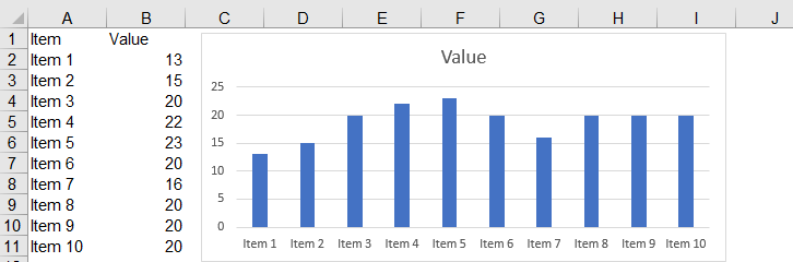
The original data

If we are using the original data (without massaging) to insert a 2-D bar chart, you will get the following:

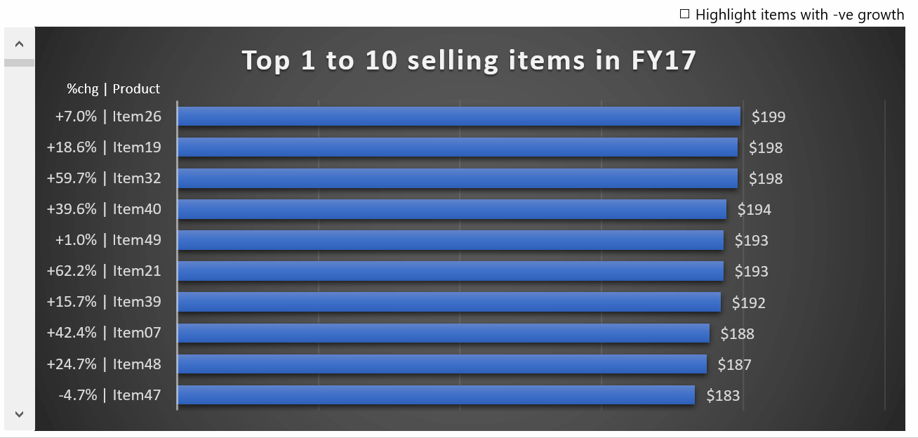
This is quite far away from what we want:
Let’s first define what we want to see from the chart:
- We want to focus on the sales in FY17. Therefore, we are not going to plot FY16 data on the chart.
- We want to see the value of each product, in a descending order from top to bottom
- We want to see the “% chg vs FY 16” to provide context
- We want to allow user to highlight items with -ve growth (i.e. giving interactivity to the chart)
Make sense?
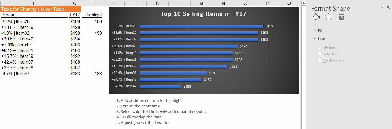
To make it simple, we will not use the original data to plot the chart. Instead, we will use a “Helper Table” for charting. This is very common to make an interactive chart.
Setting up the Helper Table
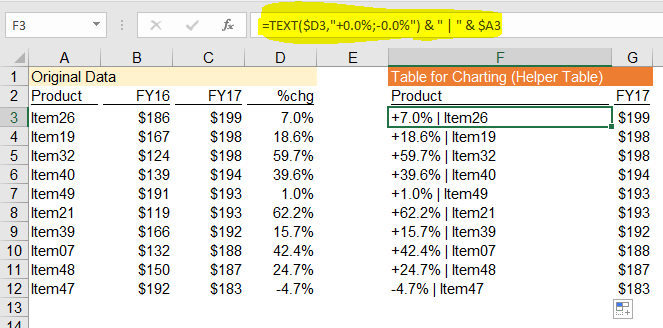
In F3 and G3, input the following formula
In F3 =TEXT($D3,"+0.0%;-0.0%") & " | " & $A3 'Copy down
In G3 = $C3 'Copy down
The formula in F3 put the “%chg” and the item together, separated by “|” for easy reading. This will become the label of the vertical axis.
Tip: Sort the original data by values of FY17 in descending order. This simple action would make the setup of helper table muuuuuuuuuuuuch easier.
Inserting 2-D bar chart
Select F2:G12 –> Insert Tab –> Charts –> 2D Bar Chart
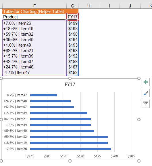
Obviously some makeups are required:
- Reverse the vertical category order, so that Top selling items on top, not bottom
- Add data label to display the value of bar
- Remove the horizontal category label, as we have displayed individual label value already, to reduce cluster
- Edit the Chart Title
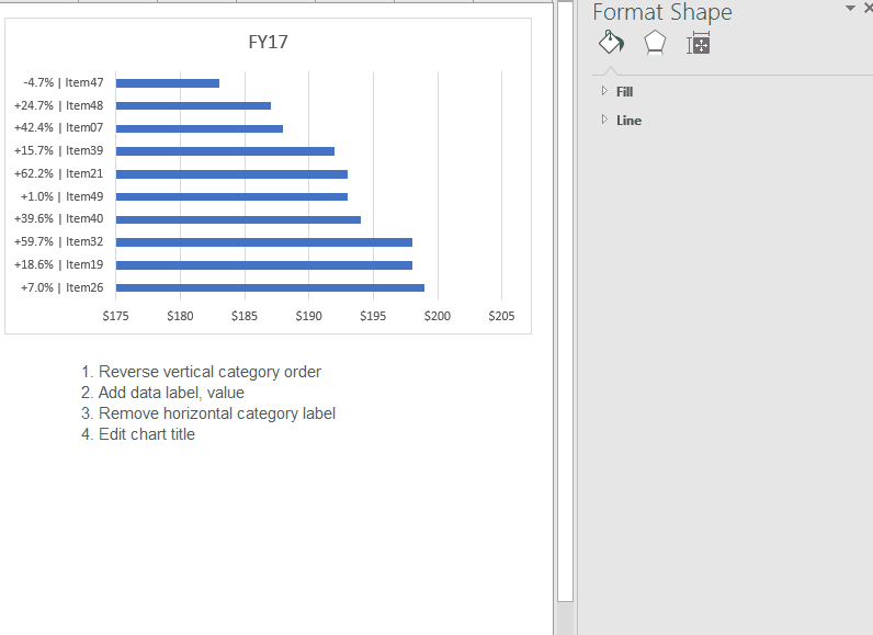
Tip: Did you know that there are many built-in styles for chart? Select the chart, you will “Chart Tools” on the ribbon. Go to Design Tab under “Chart Tools”, there you find many built-in Chart Styles. In this demonstration, Style 7 is used.

Now you should have a chart looks like this: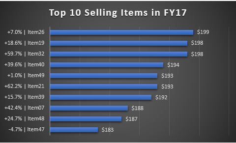
Pretty closer, right?
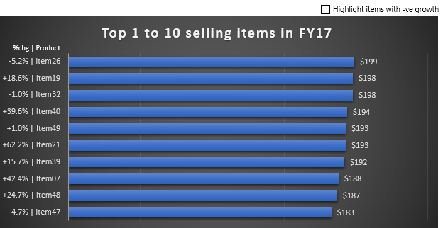
So how to highlight the bar(s) with negative growth?
The trick is simple.
- Add a series of bar of same size side by side
- Select the highlight color that you want
- Make the bars 100% overlapped
- Adjust gap width
As simple as that. As usual, an animated picture tells thousand words:
Note: If you pay close attention, you may have noticed that I had changed the data of “%chg” for Item26 and Item32 from positive to negative. I did it on purpose to enrich the visual of the demonstration.
As you see at the end of the above screen-cast, I input a value for item 21 to show you what’s behind-the-scene of highlighting a bar. What we did was to overlay another bar of different color of exact size on top of the existing bar to have an effect of “highlight”.
The final part – how to add interactivity to the chart?
By adding option buttons and a bit for IF formula.
Instead of hard-coding the values in column H, we may use the following IF formula to get the value of “FY17” (remember we need same size), if the %chg is negative.
In H3 =IF($D3<0,$G3,NA()) 'Copy down
By doing so, we basically highlight all items with negative growth.
Not yet what we want until we add a check box and link the formulas to it.
Adding Check Box
- Go to Developer Tab –> Insert –> Check Box (Form Controls)
- Edit the Check Box label
- Link the Check Box to $H$1

You may refer to the basis of Form Controls for how to add a check box and assign linked cell.
Fine-tuning the formula
Now, we are only one step away. Modifying the formula in the highlight column as follow:
In H3 =IF($H$1, IF($D3<0,$G3,NA()), NA()) 'Copy down

The formula means: When the checkbox is unchecked, highlight nothing as “FALSE” in H1 yields result of #NA error; “TRUE” yields result of Fy17 IF %chg is negative.
Here we go
Please note, when we interact with the checkbox, we are changing the underlying data of the chart. This is how we make the chart interactive. Not difficult, is it?

Next post, I will show you how to add scroll bar to the chart in order to show more data. Stay tuned. 🙂