Using Option Button to display different items on chart
So far, we have made an interactive chart with check box to highlight items with negative growth; with scroll bar to see more items in a confined space. In this post, we will go one step further: Adding Option Button to display either “Values” or “Units”:

You may download a Sample File to follow through.
The data for “Unit Sold” resides on a separate worksheet . Luckily enough it follows exactly the same structure of the “Values table”.


This makes the enhancement an easy job, if you know how to use CHOOSE function.
The syntax of CHOOSE
CHOOSE(Index_num, [value1],[value2]…)
Index_num simply tells CHOOSE to return which value argument. For example, Index_num 1 means to return value1; 2 means value2 and so on and so forth. Index_num needs to be from 1 to 254. In order words, we may input up to 254 value arguments in CHOOSE.
CHOOSE is the perfect function to accompany Option Buttons that assign sequential number to a specific cell.
You will see how in the following steps.
Inserting two Option Buttons and adding control
- Go to Developer Tab –> Insert –> Option Button (Form Controls)
- Repeat step 1 to insert one more Option Button or alternately copy the first Option Button and Paste a new one next to it
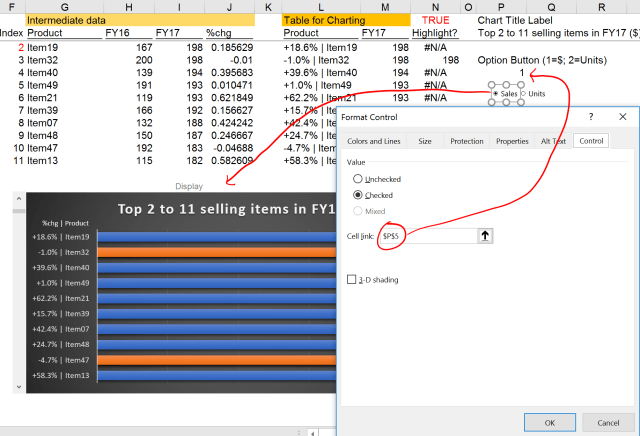
- Rename the Option Button 1 and 2 to Sales and Units respectively
- Assigned linked cell to P5 (Tip: Test the buttons to ensure the number displayed on the linked cell is in the correct order you intended to)
- Move the two Option Buttons on top of the chart
Editing the interactive chart title
Do you remember we made an interactive chart title before? We can now modify it to fit the new feature just added:
="Top "&$F$3&" to "&$F$12&" selling items in FY17" &
  CHOOSE($P$5," ($)"," (Units)")
What the formula does is to concatenate the blue portion to the original formula, i.e. appending either ” ($)” or ” (Units)” to the chart title depending on which Option Button is selected. Do you see the simplicity of CHOOSE? When the first option button is selected, it shows “$”; when the second one is selected, it shows “Units”. Isn’t it nice?
Setting up the (intermediate) helper table
Well, we have done it before. What we need to do is to edit the formulas as shown below:
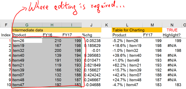
Believe it or not. Technically only three formulas (in G3 to I3) are required to modify and then copy down. That’s all what we need to make the Option Buttons perfectly incorporate into the Interactive Chart.
Original formulas:
In G3, =INDEX(A$3:A$52,$F3)
In H3, =INDEX(B$3:B$52,$F3)
In I3, =INDEX(C$3:C$52,$F3)
Modified formulas:
G3 =CHOOSE($P$5,INDEX(A$3:A$52,$F3),INDEX('Data in Units'!A$3:A$52,$F3))
H3 =CHOOSE($P$5,INDEX(B$3:B$52,$F3), INDEX('Data in Units'!B$3:B$52,$F3))
I3 =CHOOSE($P$5,INDEX(C$3:C$52,$F3),INDEX('Data in Units'!C$3:C$52,$F3))
Modified formulas explained:
=CHOOSE($P$5,
  INDEX(A$3:A$52,$F3),
  INDEX('Data in Units'!A$3:A$52,$F3))

Where $P$5 is the value determined by the Option Buttons,
[Value1] is the original formula that retrieves data from the "Value Table"
[Value2] is the formula that retrieves data from the "Unit Table"
With CHOOSE, we can use Option Buttons to determine which value (or formula) to be returned to the helper table, that will be fed into the table for charting eventually. In our modified formula above, when Option Button 1 (assigned to Values) is selected, the formula look into the dataset with value data; when Option Button 2 (assigned to Units) is selected, the formula look into the dataset with unit data. You can imagine that up to 254 different options could be added to your chart (although in real world, you would never have more than 5 options in my opinion. If you have too many options, a combo box or a drop down menu maybe a better alternative).
Hey, once you modified the formulas from G3:I3, don’t forget to copy them down.
Everything is ready. Let’s hide the data and helper rows.
Oh… What happened to my beautiful chart?

The final step
We need to check a very hidden check box…
Where is it?
Select the chart –> Chart Tools –> Design Tab –> Select Data –> Hidden and Empty Cells

There you see the Hidden and Empty Cells settings.
It is all done. Interactive Chart is not difficult to make, is it?
Side Notes – The thinking process
Reverse Thinking
Although I showed you step by step approach, I started by drafting the final output that already had all the three format controls in mind. From there, I worked backward to study the data that I have; to determine how to get the data for the chart, how to interact the charting data with different form controls; what formulas required. Another key consideration is whether I will need to enhance the work in the future? It could be quite different to build something for one-time use and something for long-time use with potential “upgrade” required.
Make use of helper cells is not a shame at all
As you see, the (intermediate) helper tables make the whole process super easy. Without the helper tables, you will find unnecessary complexity when you need to add a new control to your chart.
Put it into action
Once we see the door, we have to walk through it in order to discover what’s behind. Don’t be afraid of failure. Trial and error is the most valuable learning process. Isn’t it?
Test the output
Honestly I made a lot of modification in the process. You won’t realize some minor but obvious mistakes until you test it, again and again. Ideally show it to a third person for fresh idea. You are more than welcome to provide comments and suggestions to make it a better one. 🙂
I hope you’d enjoyed this short series of making Interactive Chart.


this is sick !!! very nicee!!
LikeLike