First of all, I would like to thank Chandoo for suggesting this name for the chart I submitted to him for a charting contest a few months ago. What’s more surprising to me is I was one of the winners of the contest. What a honour of mine! 🙂
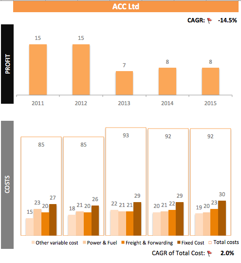
Here’s a screenshot of part of the chart I prepared. You may view the full chart and download a copy of the workbook from Chandoo’s site here.
Don’t miss the entries from other participants as you will learn a lot of Excel techniques from them.
What you see above is actually a Panel Chart… meaning more than one charts are putting together intentionally to visualise the data of interest. The upper part (showing the yearly profit) of the chart is a simple clustered column chart; the bottom part (showing the yearly costs with four components) may be something of your interest to know about, right?
It is not difficult at all to create. Let’s do it step by step:
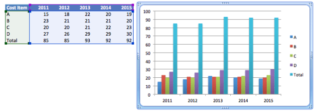
Prepare your data –> Make sure you have the “Total” data
Tip: Input the years as text, i.e. start with an apostrophe ‘2011 so that Excel won’t misunderstand them as data to plot.
Select the range of data –> Insert –> Column –> Clustered Column
Up to this point, you should see a chart like below:
If you see something like the following instead,
you may need to go “select data” and then “Switch Row/Column”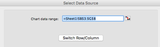
or
simply click the  under “Chart” on the ribbon.
Now let’s do a little make up to the chart by changing the rainbow into themed color with different intensity. Using Chart Style is a quick and easy way to do it.
Select the chart –> Go to Chart Style –> Select the style you like
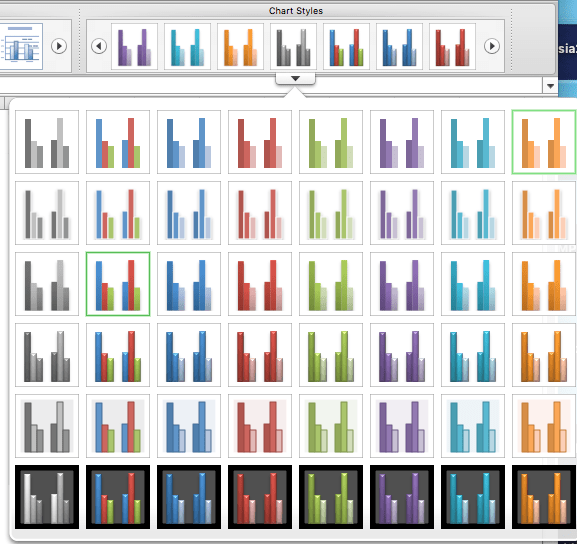
In my example, I used the rightmost one on the first row. And now you should be able to get a chart like this:
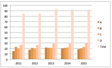
Then you are ready to make the “Container Chart”…
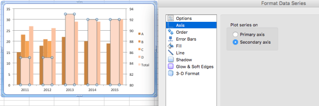
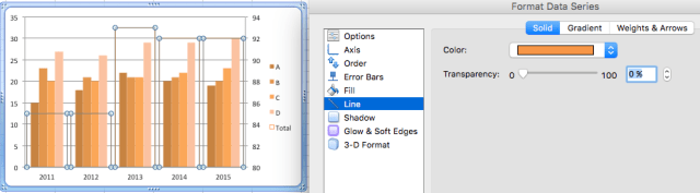
Select the “Total” series by right-clicking any of the “Total” columns –> Format Data Series…

Make it the “Secondary axis”
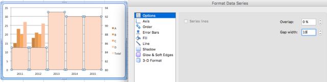
Set the Gap width: 10 (more or less) according to your own preference
Set the Fill Color: “No Fill” in order to make it transparent
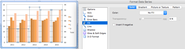
Set the Line Color accordingly. You may also set the weights of the line
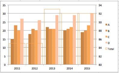
Now your chart should look like:
Further tidy up is required…
Delete the “Secondary Axis” so that all columns are of the same scale
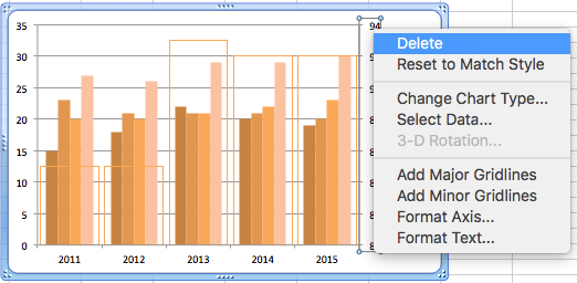
Delete also the “Primary Axis” to make it less cluster (as we will add data label later)

Delete the gridline to make the chart more “clean”
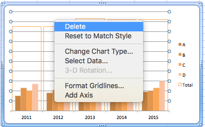
Move the Legend to the bottom

Add Data Labels to each series by right-clicking the series
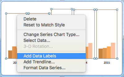
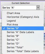
Tip: It’s a bit tricky to select the Series “A” to “D” as you can hardly click on them. To tackle that, select the series from the ribbon instead. Look for the following dropdown that appears on the left of the ribbon under “Chart Layout”.
Once you are done with all the series, you should get the following: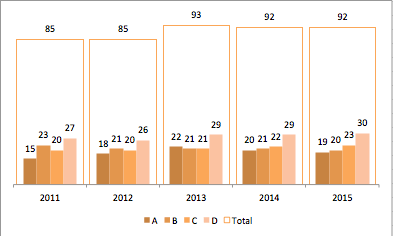
To make the same chart for different companies, just copy the chart, change the data sources and color theme accordingly.
As simple as that.
How do I come up with such chart? To me, the chart is a combination of Stacked Column and Cluster Column. So let’s take a look how it would look like if we plot the data into a Stacked Column and Clustered Column respectively.
Stacked Column
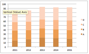
- Pros: Total trend is clearly presented
- Cons: Trend of individual components are not clear except the first one because they are not sitting on the same base.
Clustered Column
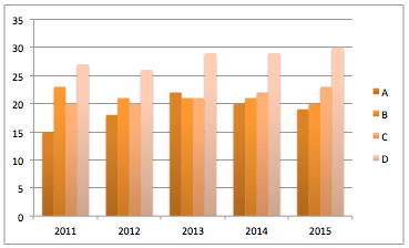
- Pros: Trends of individual components are clearly presented
- Cons: Difficult to see the trend of total
Apparently, they supplement each other. Then why not combining them together into one?
I have never thought about naming this chart.
How would you name this type of chart? Please leave your suggestion in comments.
p.s. All the screenshots in this post are captured by using Excel 2011:Mac.