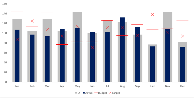
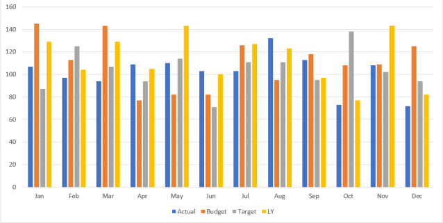
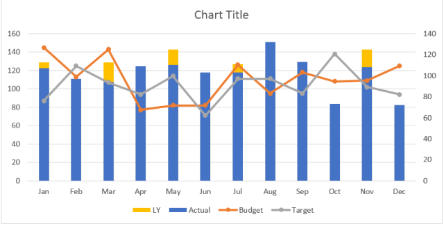
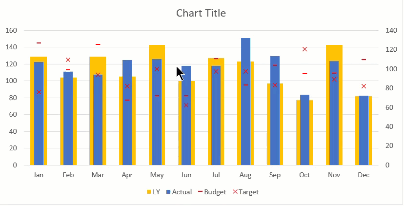
…for Actual vs Budget, Target, Last Year

If
- you need to plot chart to show actual sales vs budget, target, and LY sales;
- agree that the chart on the right is a better visualization such purpose;
- want to know how to create the chart on the right;
Then
- please continue to read this post.
In business world, we often compare actual sales to various benchmarks such as budget, target, and last year. In this post, I am going to show you step-by-step how to make a compelling chart for this purpose. This is basically a simplified version of bullet chart, and is super-easy to create. I hope you find it useful and relevant.
Indeed, the make the following chart is easier than you may have thought… well, in less than 3 minutes when you know how.
You may download Sample File to follow along.
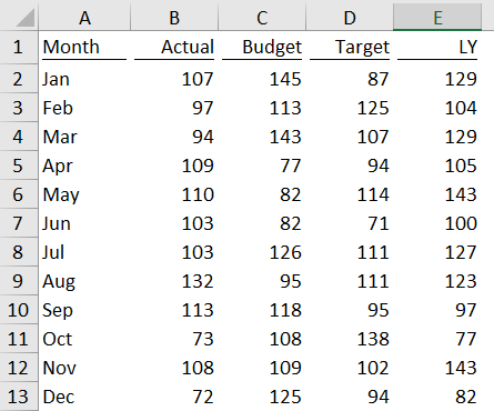
1) Prepare the data
This is very straight forward:
2) Ride on a default Cluster Column Chart
Note: All screenshots on this post are prepared with Excel for Office 365. You may find the UI a bit different if you are using Excel 2010 or before, but the elements are more or less the same.
- Select the range of data for plotting chart
- Go to Insert tab
- Select Column Charts
- Select 2-D Cluster Columns
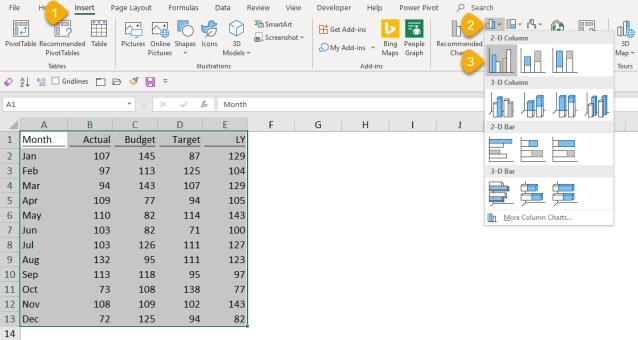
Now we should have this basic and the most commonly seen chart… Let’s do some make up to it.
3) Change Chart Type
- Select the chart
- Go to Design Tab of Chart Tools
- Change Chart Type
- Select Combo type when the “Change Chart Type” dialog box opens
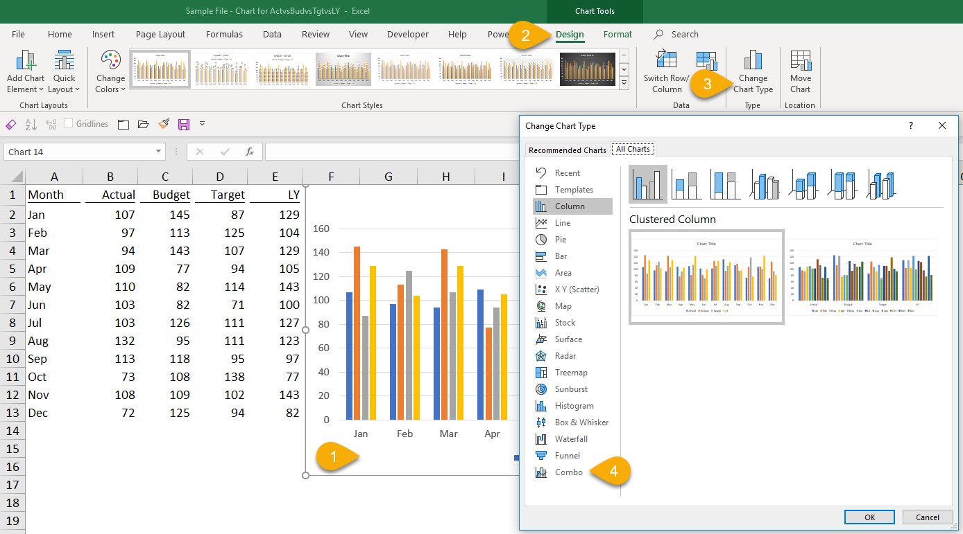
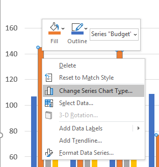
Tip: The above steps can be done by right-clicking on any chart series and select “Change Series Chart Type…”
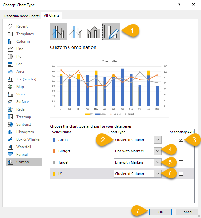
4) Edit the chart types for the four data series
- Select the “Custom Combination” of Combo chart
- For data series of Actual, select “Clustered Column”
- Make it as “Secondary Axis” (This step is crucial)
- For data series of Budget, select “Line with markers”
- For data series of Target, select “Line with markers”
- For data series of LY select “Clustered Column”
- Press OK
Now we should have the chart like this:
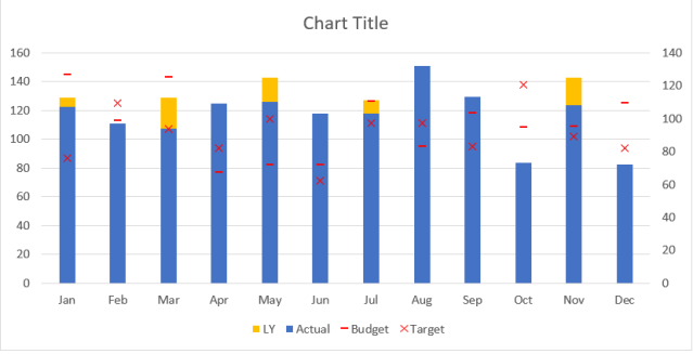
5) Remove the lines and change the markers (for both Budget and Target series)
- Right-click the line for “Budget”, select Format Data series
- On the Format Data Series pane, select Fill and Line
- Select No line (under Line)
- Select Marker
- Open the Marker Options
- Select “Build-in” and select the market type you want. (“-” is use in our example)
- Change the colors of Fill and/or Border (if you wish) (Red is used in our example)

Repeat the steps above for “Target”, but choosing a different marker. (“x” is used in our example)
Now, we should be able to see a chart like this:
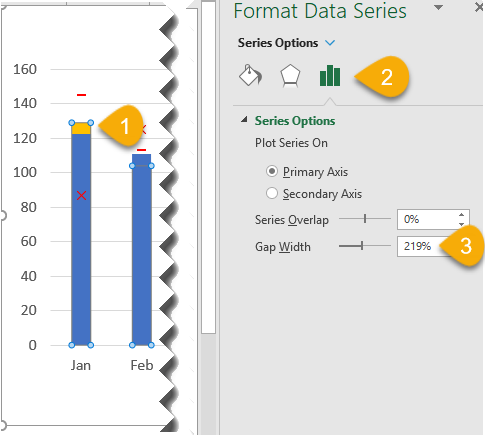
6) Adjust the column width
- Select the data series of LY (by clicking on any one of the columns; please be careful not to select only one column of the series, we need the whole series)
- Select Series Options
- Set the Gap Width to “80%” (or any other value of your preference)
Note: The gap here means the gap between columns, the narrow the gap is, the wider the column is.
Now we should have this:
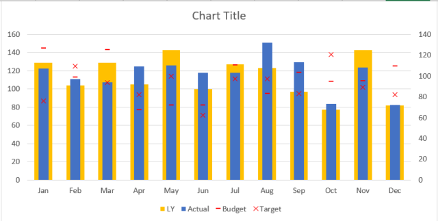
7) Change the Fill color of the columns
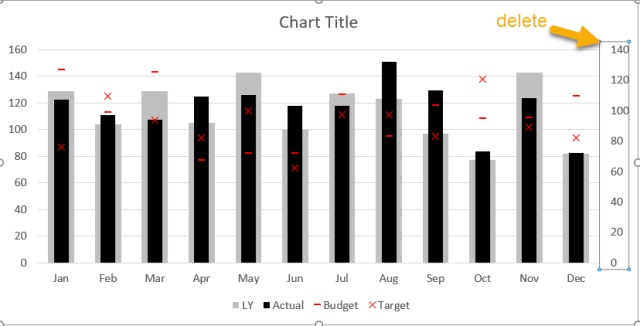
8) Delete the Secondary Y-axis
- Select the Secondary Y-axis and press DELETE
Did you notice that the visual doesn’t look right? The Actual sales of Dec is 72 while that of LY is 82. How come it appears on the chart that the Actual is “taller” than LY on Dec?
It is because the Actual series is set as “Secondary Axis”, which has a different scale from the “Primary Axis”. Please be very careful about this. Depends on the dataset, both primary and secondary axis may have the same scale when you first set it up. This may not alert you on this “potential and critical” error. So please ensure you “DELETE” secondary Y-axis.
Here we go!
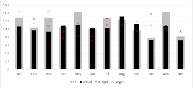
Easy, right?!
Honestly, once you know the steps, you may transform the chart from the default to this compelling chart in less than three minutes. So why not?
Please let me know what you think about this by leaving comments.
Bonus topics
Wait… the above steps haven’ show how to make the marker for “Budget” wider, as shown below:
You are right.
I leave it in the “Bonus time” on my 2nd video (which is coming soon now available ), in which not only do I show you how to create this chart step-by-step, but I also discuss briefly why this is better than the default cluster columns. I will embed the video here once it is ready (voice-over, subtitles and editing are in progress).
Please stay tuned. 😉
Well… after one week, the video is now ready for watching. Hope you enjoy it:
Note: Please turn on CC for English subtitles
And after one year and three months, here’s a video with English Voice Over:
A better way is to subscribe to my YouTube Channel. You support is highly appreciated. 🙂