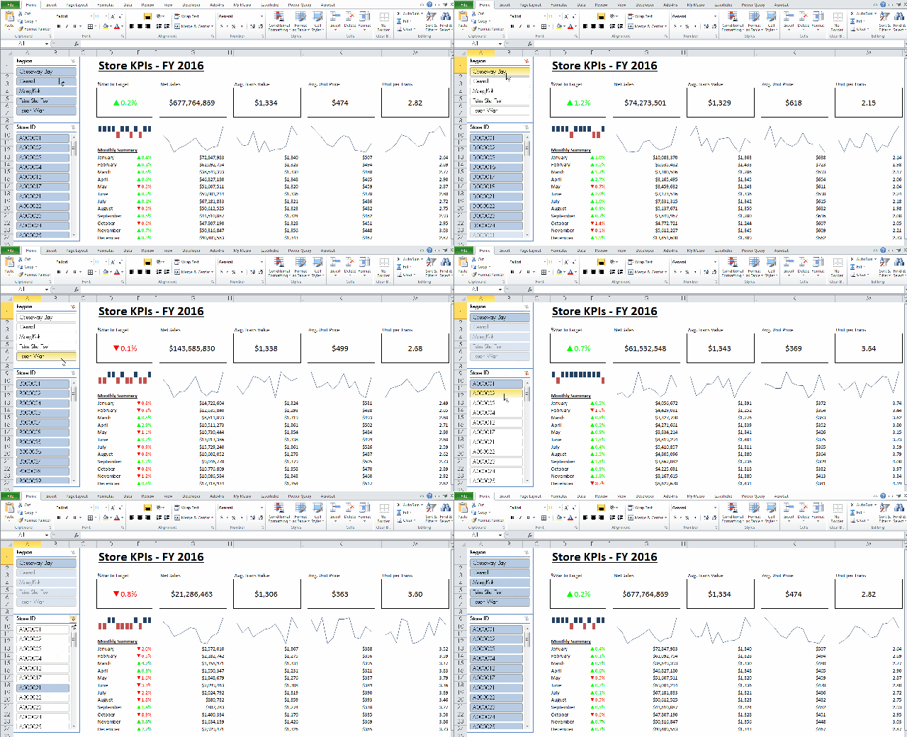
Have you ever thought of building an Excel Dashboard in 5 minutes? Yes, only 5 minutes. That’s why it is a Challenge! You may find the details of The 5-minute Excel Challenge at Bacon Bits.
Honestly, I haven’t thought of building a dashboard in such a short time. In my experience, it takes hours (if not days) of work to create a dashboard. Nevertheless, after reading the very last sentence of Mike’s post regarding the challenge:
“I’m very much looking forward to seeing all the cool things our Excel community can create!”
I’d decided to take the challenge. And I managed to finish it in four and a half minutes! 🙂
As I am working in retail industry, I take the challenge with something I am familiar with: Store KPI Dashboard.
In my entry, I created a dataset of daily sales record for 56 stores across 5 regions in a year. It is a dataset of more than 21k rows. (Of course, they are all fake data)
In my dashboard, I show the following KPIs with monthly trend line and summary:
- % Variance vs. target
- Net Sales
- Average Transaction Value
- Average Unit Price
- Unit per Transaction
Needless to say, the dashboard is an interactive one that users can look at the KPIs of all stores, a particular region(s), or even a particular store(s).
Techniques used:
- Pivot Table
- Calculated field of Pivot Table
- Get Pivot Data function
- Slicer
- Sparklines
- Lot of shortcuts: e.g. Ctrl+Shift+4, Ctrl+Shift+1, Ctrl+1
- Format Painter (esp. the use of double clicking the Format Painter)
- And lots of Copy and Paste 🙂
You may watch or download the making of my entry HERE.
I have to admit that I need some rehearsals in order to finish it in 5 minutes. Moreover, the resulting dashboard is a simple one. I believe there are rooms for enhancement, given more time is allowed.
Some thoughts of enhancement (if time is not a constraint):
- Top and bottom stores
- Radio buttons to allow users sort top/bottom stores by different KPIs
- Highlight stores that are below average or user-defined benchmark
- A bubble chart that places stores into a metric by Number of Transaction and Average Transaction Value
- …
You have got better ideas? Please leave your suggestion in comments.
Or even better, show your dashboard skill, take the challenge! There are super nice prizes for winners. 🙂
All entries will be uploaded to the official 5-Minute Challenge YouTube Playlist. I am looking forward to learning from the community for “out-of-the-box” approaches in using Excel.
Last but not least, I am more than happy if you give me a “like” to my entry in the official 5-Minute Challenge YouTube Playlist. 🙂


Unfortunately, Mike’s entire blog (data pig technologies) is no longer active.
LikeLike
Nice job – a real dashboard with time to spare! Mine took 4:59 and was more of what I call a slapdashboard. Fun experience.
LikeLike
Thanks for your kind words, Doug.
I will spend an hour on Saturday to watch all the entries.
Agree with you that is a fun experience! Thanks to DataPig! 😀
LikeLike
Awesome!
LikeLike
Thanks 🙂
LikeLike