🎵🎤Do you wanna build the Sparklines?
Sparklines is not a new feature of Excel. It was introduced in Excel 2010. Yes, almost a decade ago. But I am quite sure it’s still something new to a lot of regular Excel users. Sparklines is a great tool to enrich your report and it is super easy to implement.
You may watch this short video to learn it in one minute:
If you prefer reading to watching, please continue with this post.
You may also download a Sample file to follow along.
First thing first: Where is Sparklines?
It’s under Insert tab of the ribbon.
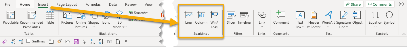
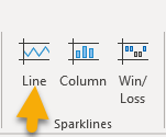
There are three types of Sparklines:
- Line
- Column
- Win/Loss
Line and Column, by their names, are quite straightforward. Let’s demonstrate with examples.
Line Sparklines
When we click on the Line of the Sparklines, the following dialog box opens:
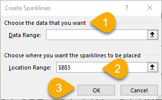
- Input the data range from where you want your in-cell chart (Sparklines) to be plotted
- Where you want your Sparklines to be places (the default cell reference is your current active range)
- When you are ready, click OK.
In our example, the respective inputs are shown below:
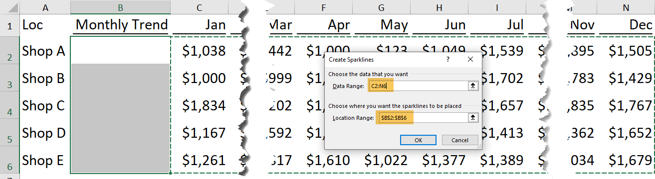
Here we go!
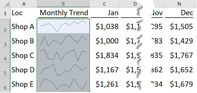
We may stop here, or go further…
The Sparkline tool
When we select a cell with Sparkline, we will see a tab of Sparkline appeared on the ribbon, where we can have more controls on the appearance of the sparklines.
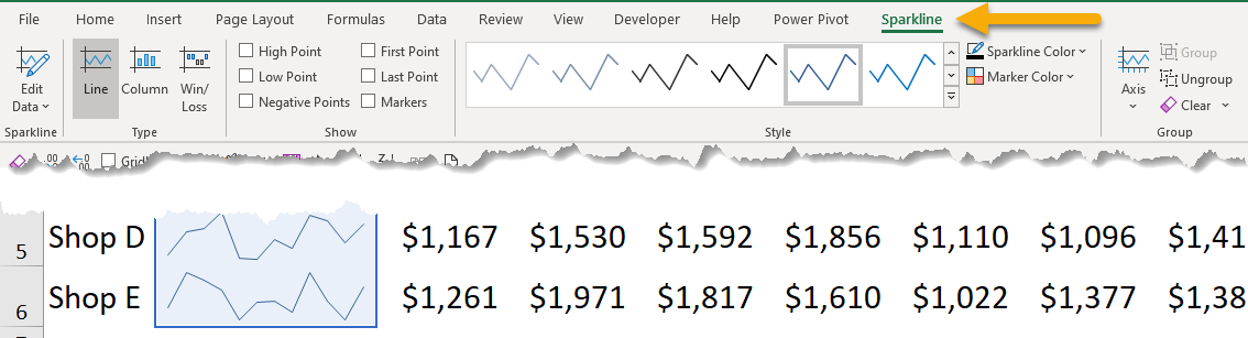
For example, we can apply different styles or colors of the line:

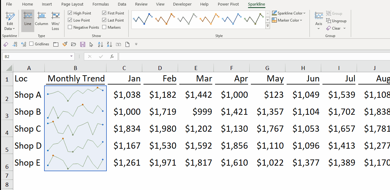
We may also add High/Low/First/Last Points, or apply markers for each data point.
And we can customize the color of each point too. 🙂
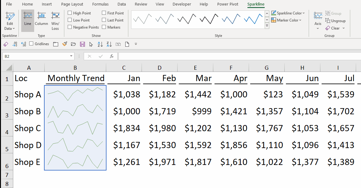
Note: Negative Points is not demonstrated above… but you should know. 😛
Column Sparklines
Want to change your mind with Columns instead? No problem! It’s just one-click away.
Did you notice that the colors of different data points are preserved? And of course, we may edit it again.
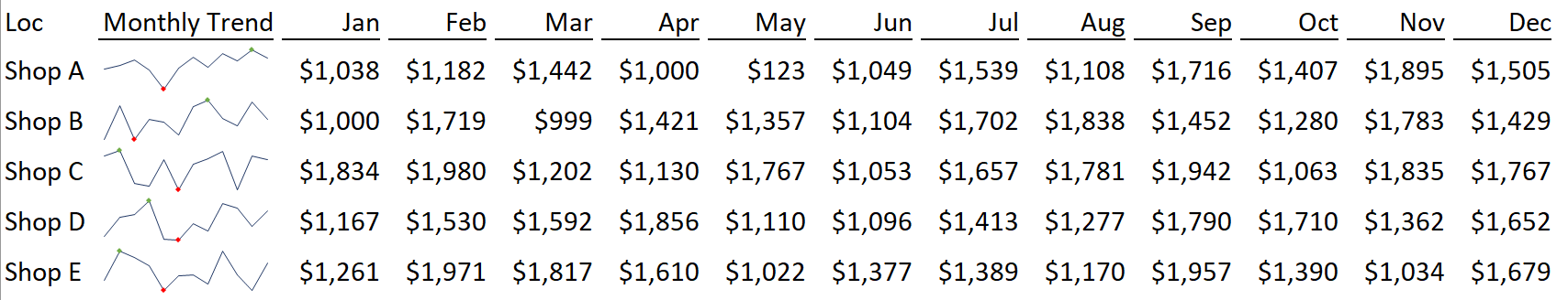
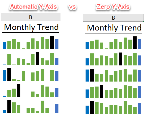
Note: Sparklines are intended to show trend. And thus, the Y-Axis is, by default, set as automatic.
When we use Column, as a general rule, it’s recommended to set all columns starting from 0. (You will see why soon). This is how we do it:
- Click the “Axis” pull-down under the Sparkline tool
- Set the Vertical Axis Minimum Value
- Set it to 0
- OK
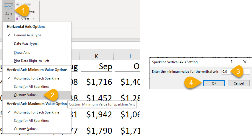
Let’s watch it in action:

See the difference?
Win/Loss Sparklines
What about Win/Loss? It’s for figures with positive/negative.
For example, if we are dealing with percentage change and we want to visualize the occurrence and position of ups and downs, it may be a good idea to use Win/Loss sparklines.
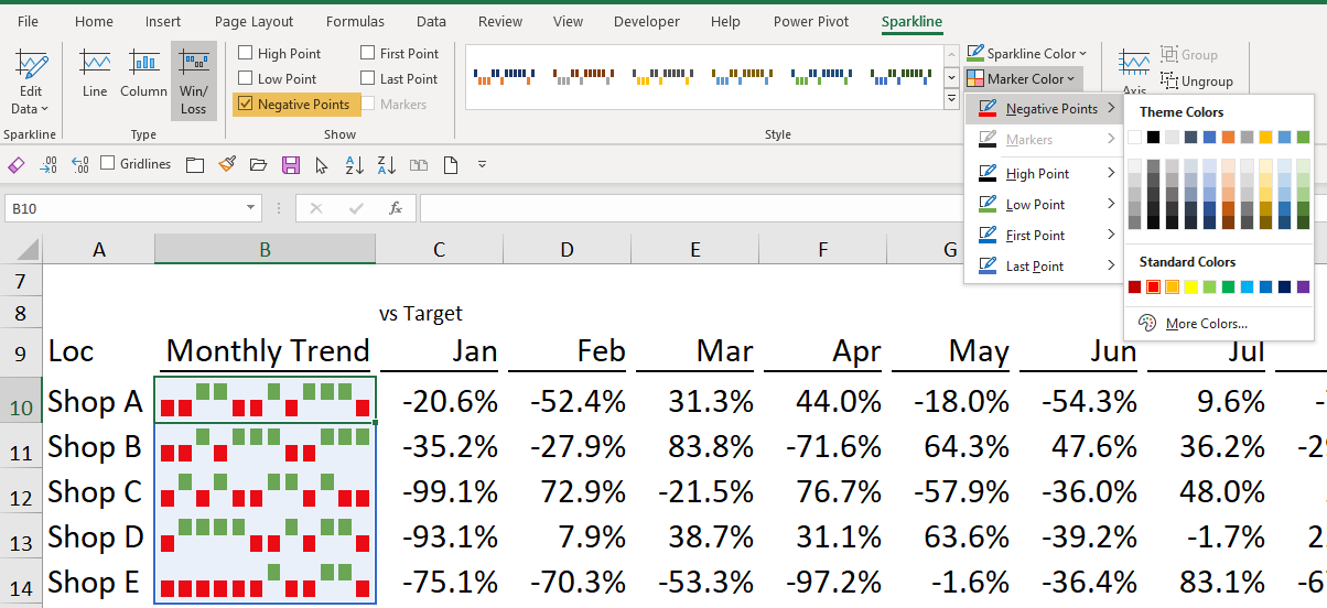
Please note what’s checked on “Show”. Try it out with the sample file.
As simple as this! 🙂
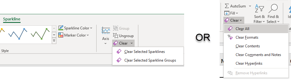
To Clear Sparklines…
… is a bit tricky. We cannot press the “DELETE” key on keyboard to remove sparklines. In order to remove sparklines, we can use the Clear button under Sparkline tool, or Clear All button under Home tab.