Have you ever seen an Excel sheet with in-cell bars to visualize the data like the ones below, and wonder how they are made?


Believe it or not, you can do it in one less than a minute with Conditional Formatting.
Let’s watch it in action:
Please continue to read this post if you prefer reading to watching.
You may download a Sample File to follow along.
Here’s the step by step instruction.
- select the range of data of interest
- Home tab –> Conditional Formatting
- Data Bars
- Select any one of the options you prefer (Tip: hover your mouse to see preview)

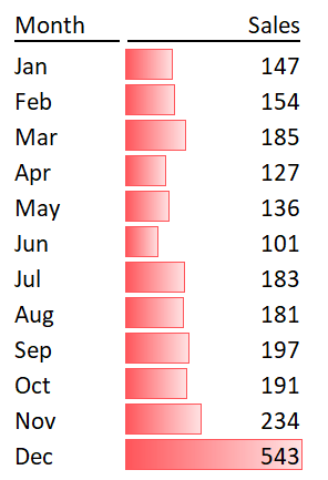
DONE! This is the result.
Can’t believe it’s so simple?! 😁
As you see from the above result, the bar will inevitably overlay on (some) numbers as they share the same cell. To avoid that, we may place the bar onto the next column, like this:

To achieve this, we need to duplicate (link) the values to the cells next to it.
In D3, input the formula
=C3 'Copy down

On the “duplicated” values, apply the same steps before

Apply extra steps to make the values invisible
Select the range of data with the data bar.
- Go to Home tab –> Conditional Formatting
- Mange Rules…

When the Conditional Formatting Rules Manager shows up,
- Edit Rule…
- OK

Then,
- Check the “Show Bar Only”
- OK

And OK.

And here we go:
As simple as this. 🙂
Tip:
We may have more options on the filled colors of the bar on the step “Edit Formatting Rule”. Try explore it.

Extra tip: Adjust the column width for different bar length.
Conditional Formatting is a cool feature in Excel to visualize data in an easy way. When used properly, your data stand out. However when overused, it may create noise rather than insight. Use it wisely. ;p