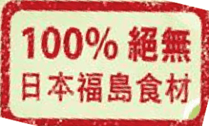
Well, this is not an Excel post. This is something about Visual Presentation at a glance, so I think it’s sort of related to Excel. 🙂
One day, I visited a Japanese Fast Food Restaurant and saw the above sticker on every table. It means “100% No Fukushim Ingredient” (direct translation). Just at a glance, I thought it is “100% Fukushim Ingredient”.
Take a look at below,
What message do you get at a glance?
hmmm… I got “100% Preservatives”.
Normally person read from left to right, and scan the beginning and the end of a sentence for quick meaning. There the “100%” does more harm than good for the above scenario.
With just a slight modification as below, does it make a difference?
Which one is better? Left or Right?
Conclusion:
Do not put something to “enrich” a message just for filling up the space.


You’re dead right here. The implication of the %, even if its 100% is that there is some proportioning going on. Of course, 100% says there’s no such thing, but it is, as you point out, much easier just to say “no”, which is unambiguous, requires no mental work figure the semantics, and has more urgency to it.
LikeLike